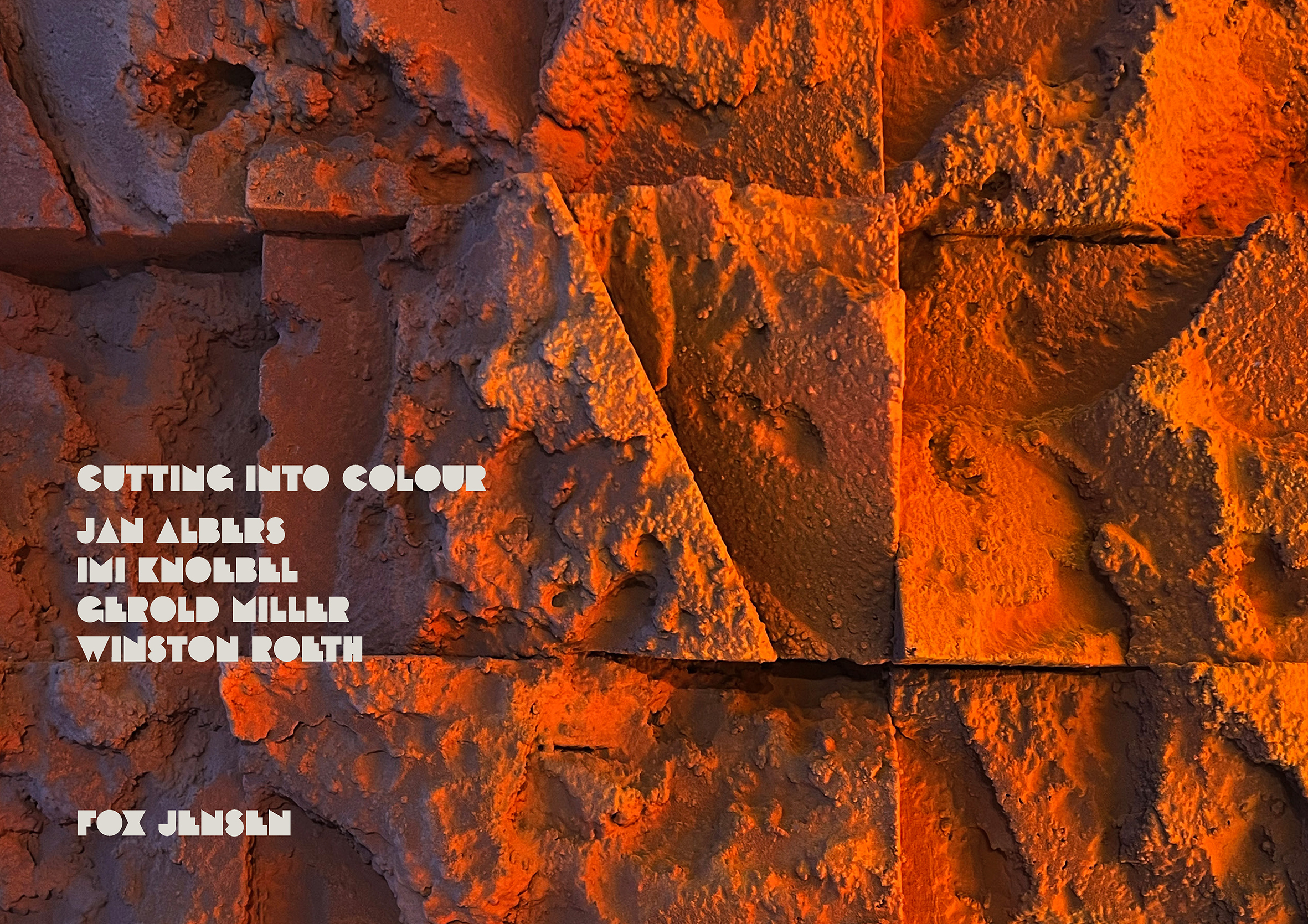
Cutting into Colour
Cutting into colour reminds me of the sculptor’s direct carving.
Henri Matisse.
When Matisse suffered the failing dexterity that he needed to paint, he set the brush aside and picked up scissors, making some of his most compelling works. These late works of Matisse re-asserted a new version of form and colour in more diverse ways that allowed him to entertain fresh approaches to the object and indeed the larger environment.
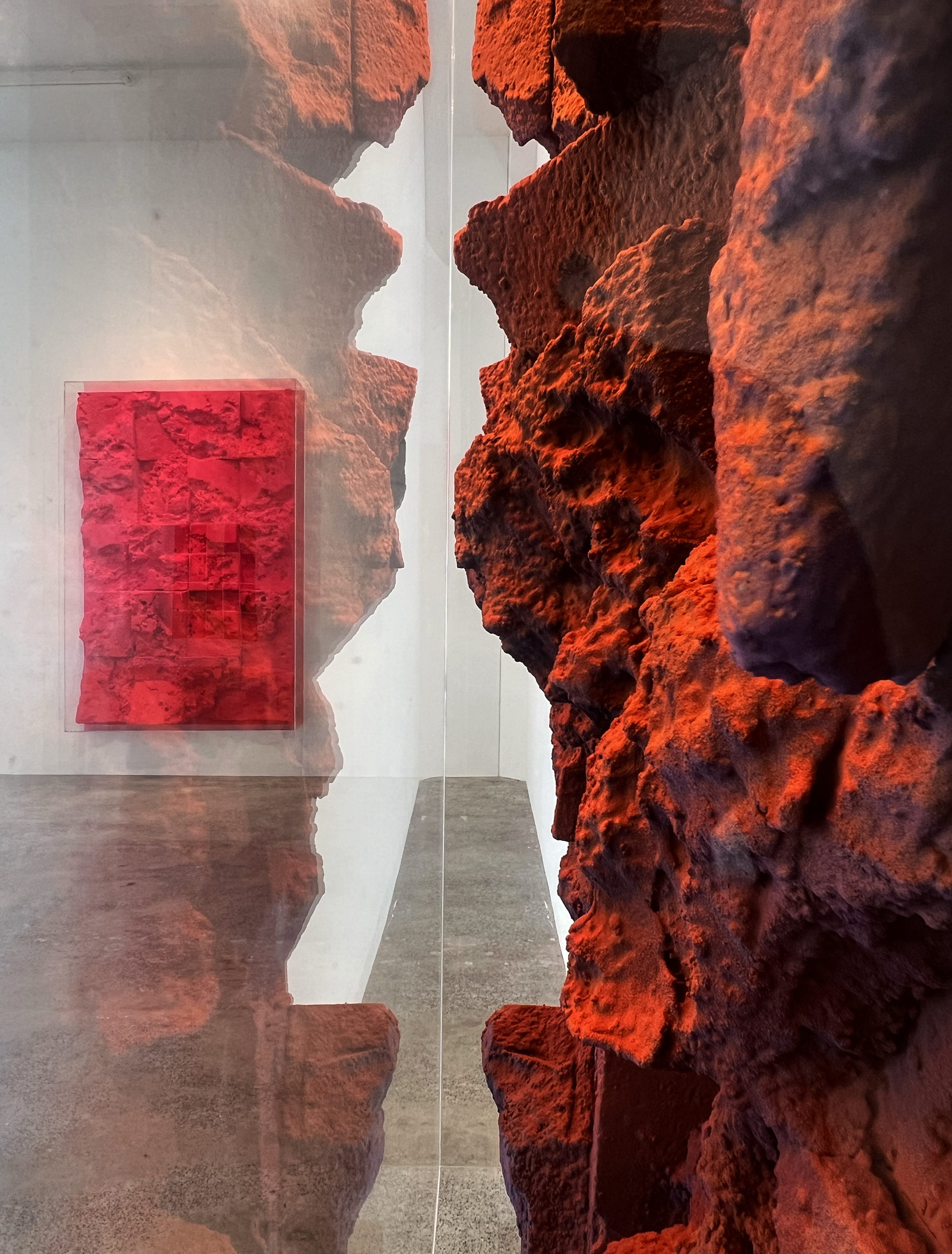
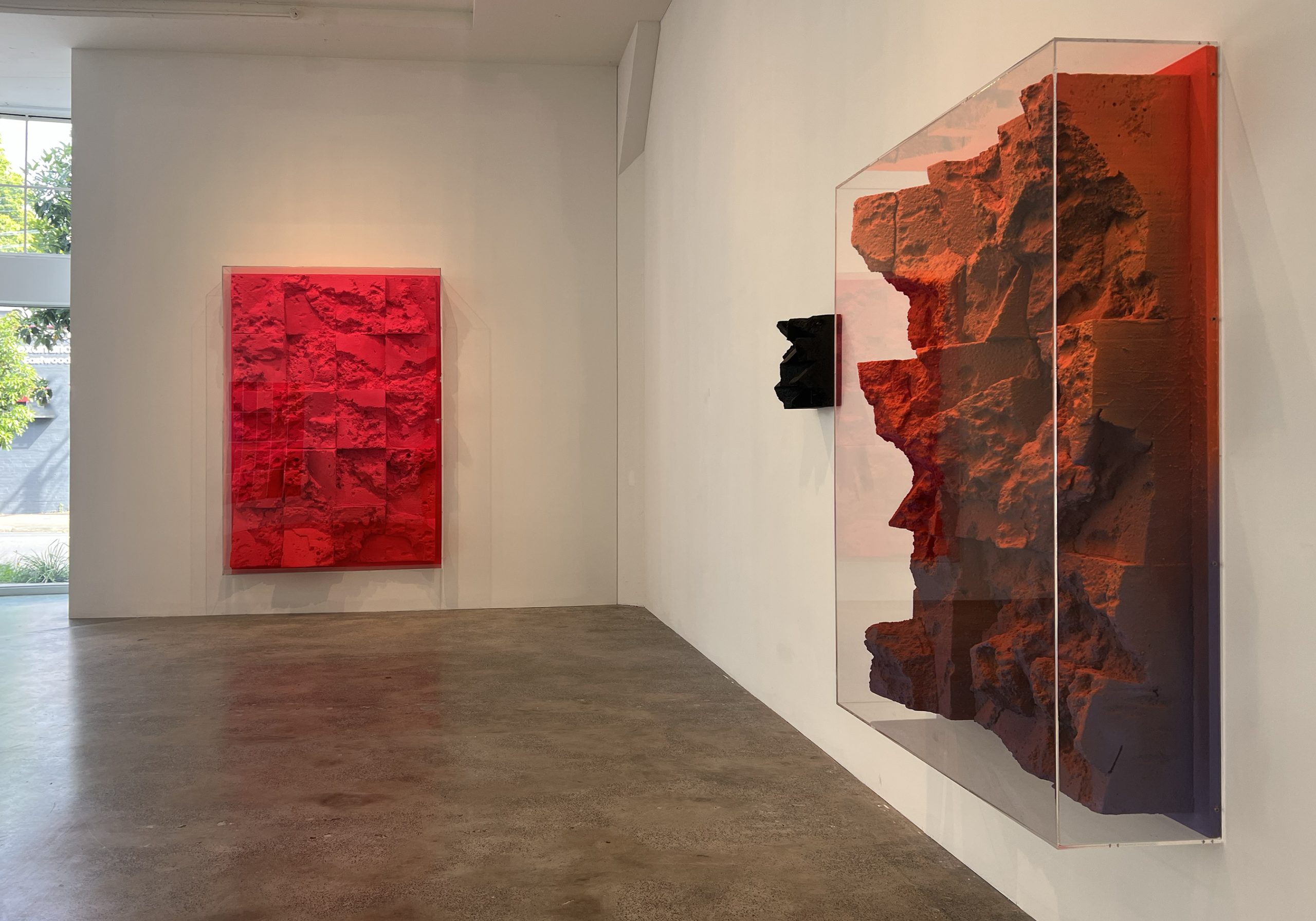
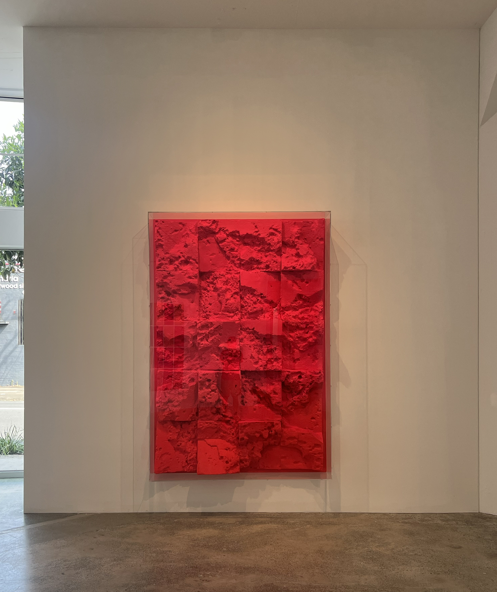
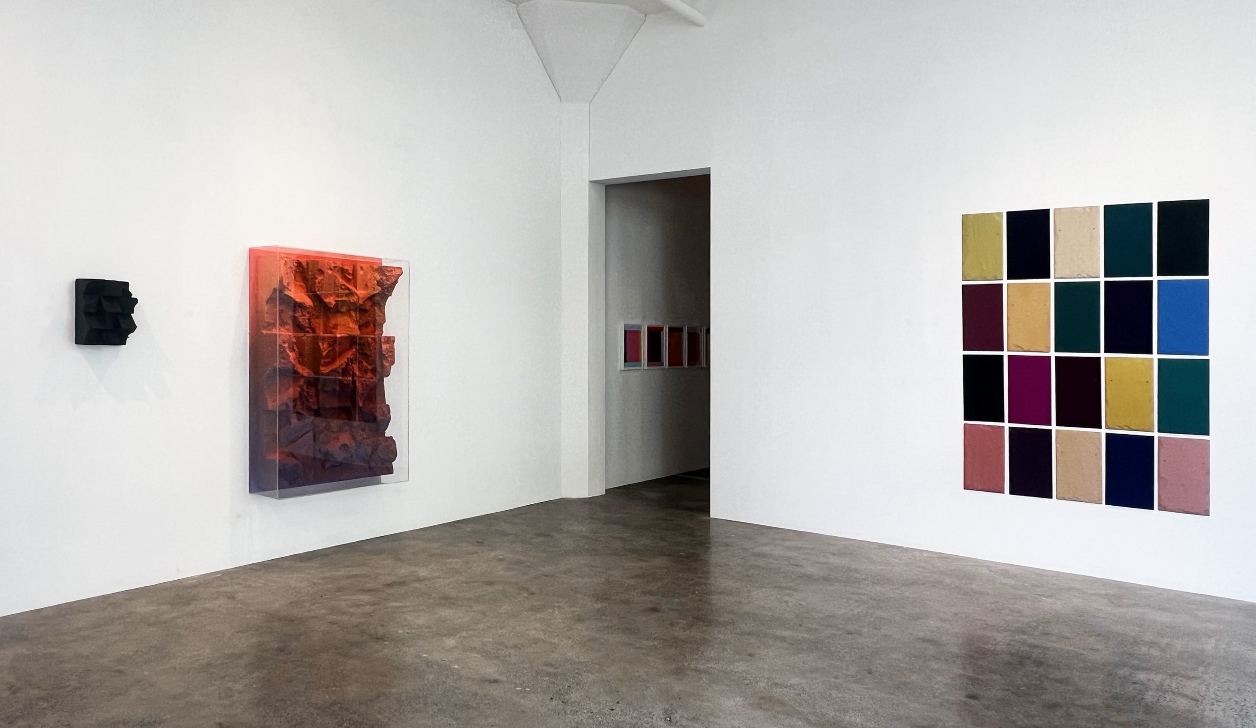
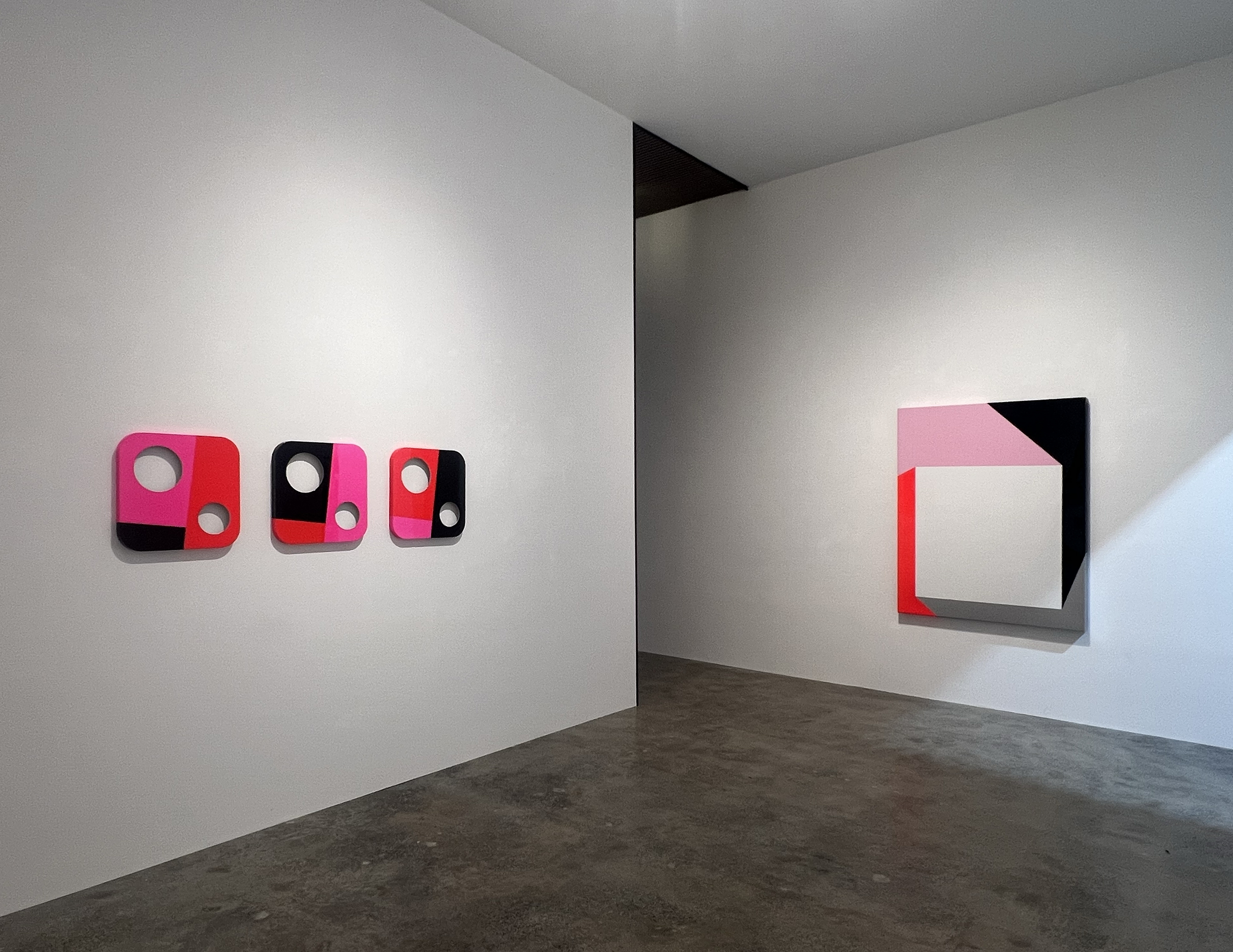
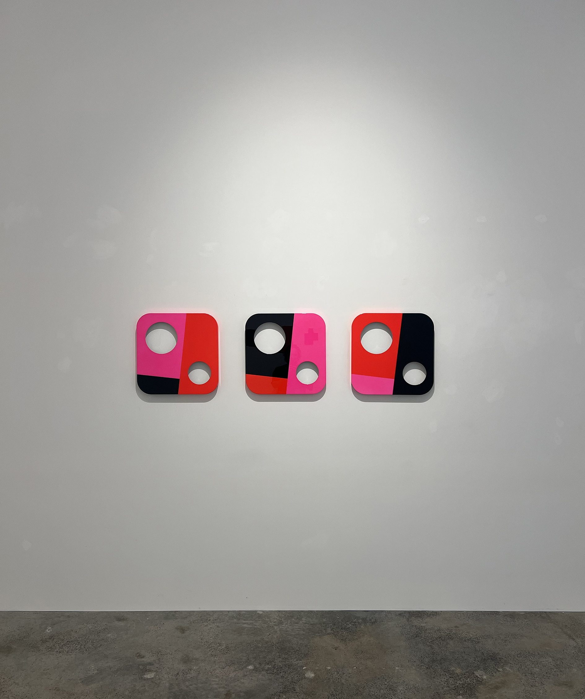
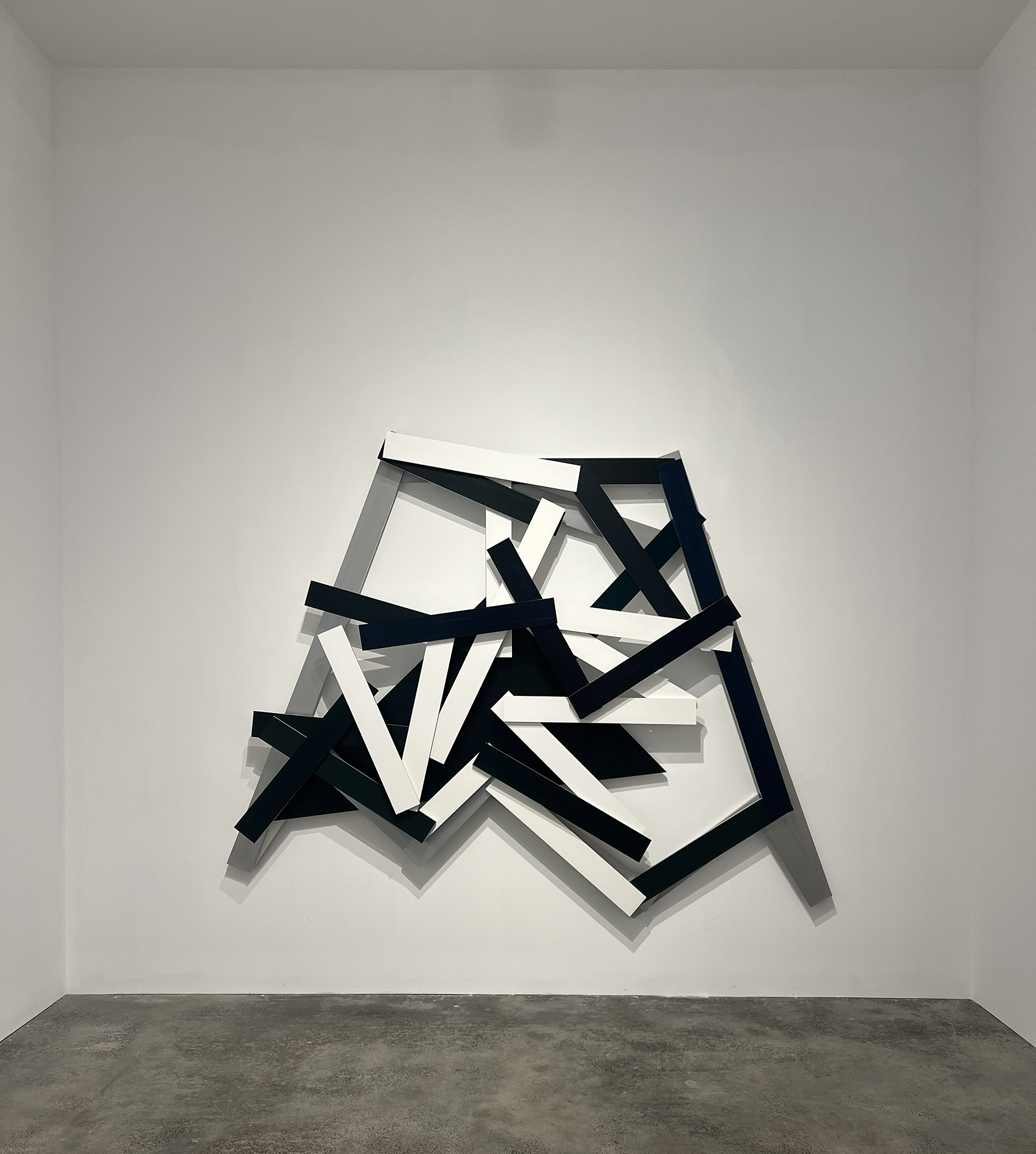
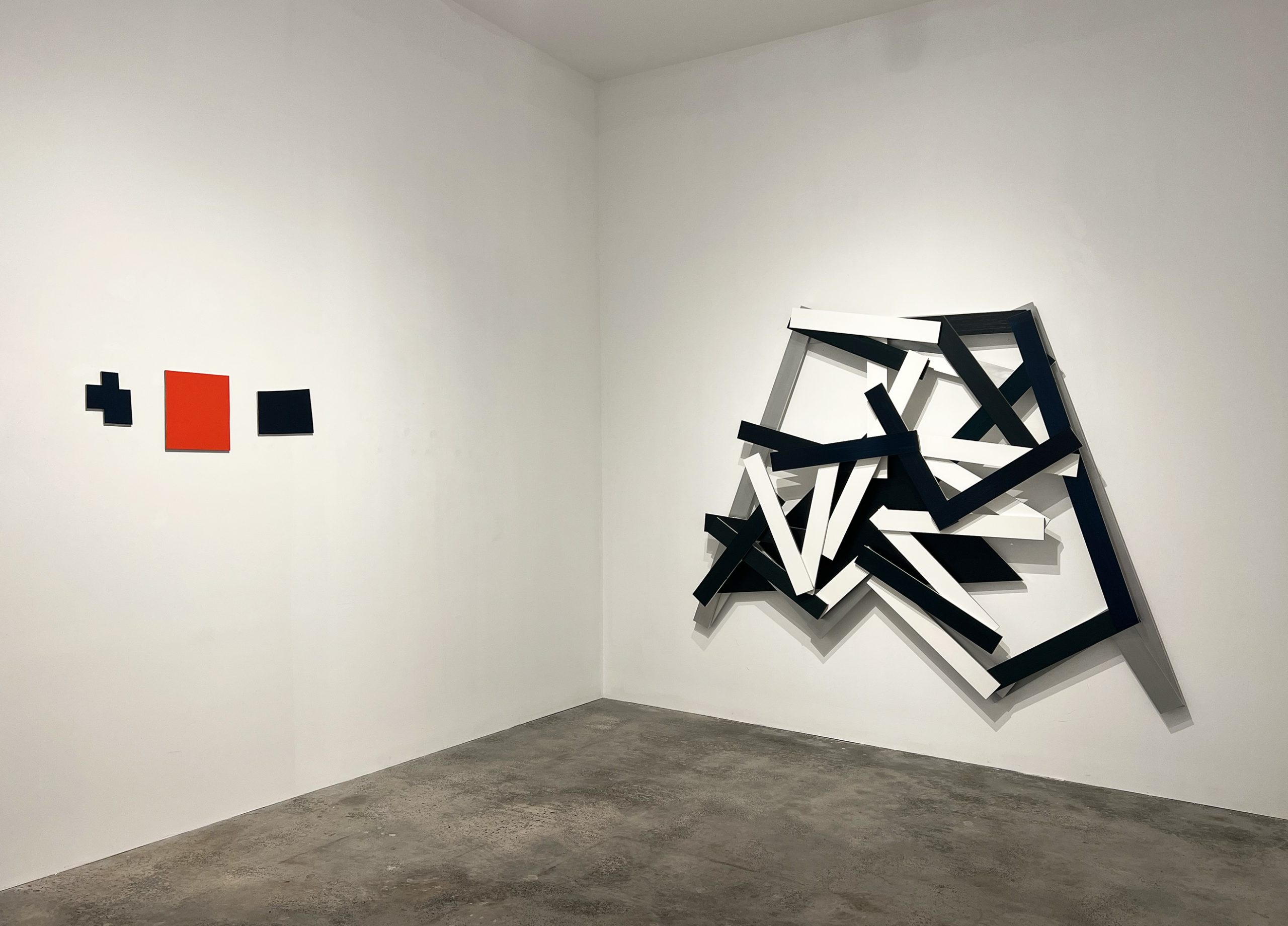
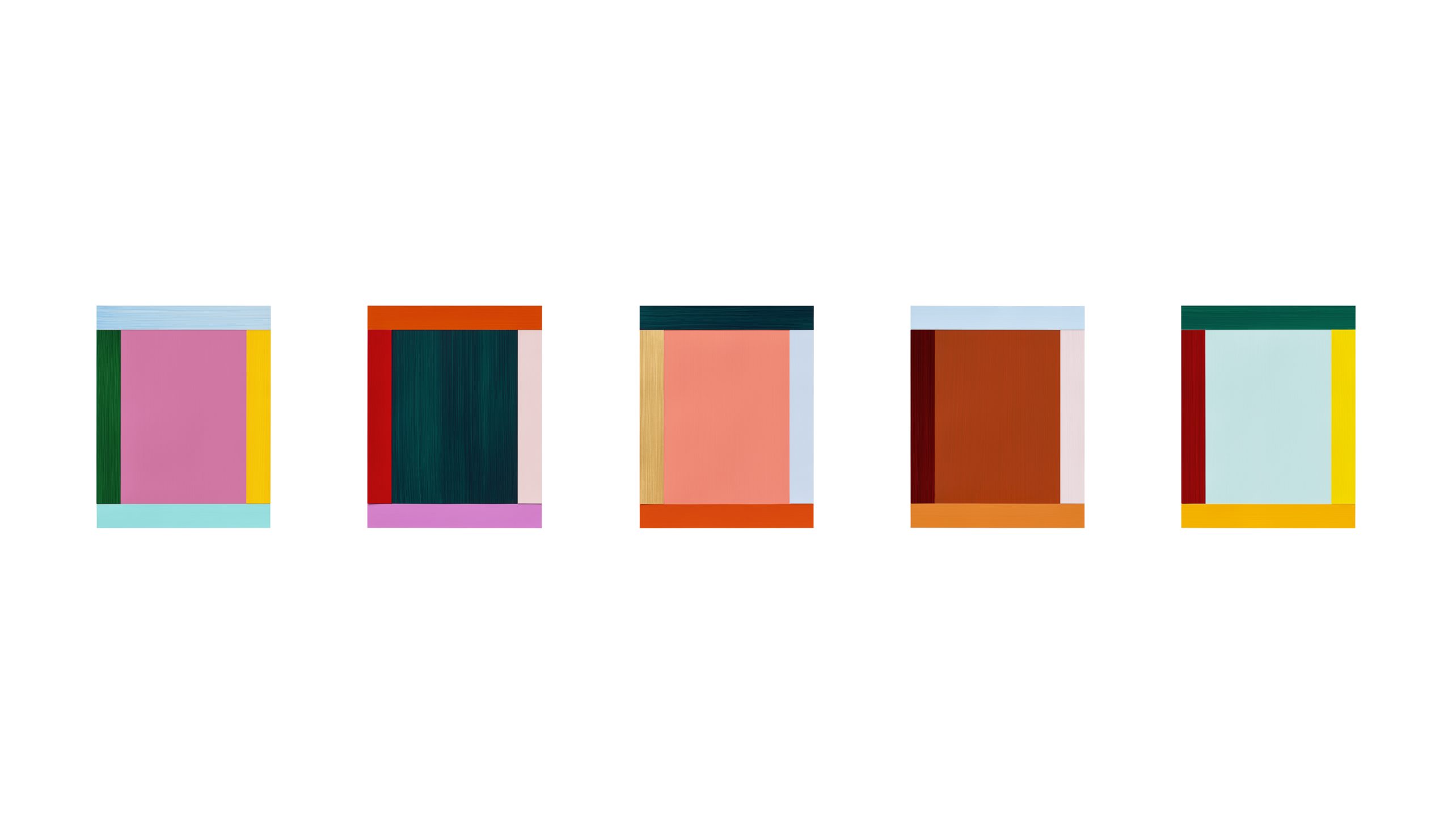
Cutting Into Colour certainly celebrates the vivacity of colour but crucially it explores each of these artists’ idiosyncratic approach to the material body of the support and how their individual approaches undo aspects of the restraints of the pictorial.
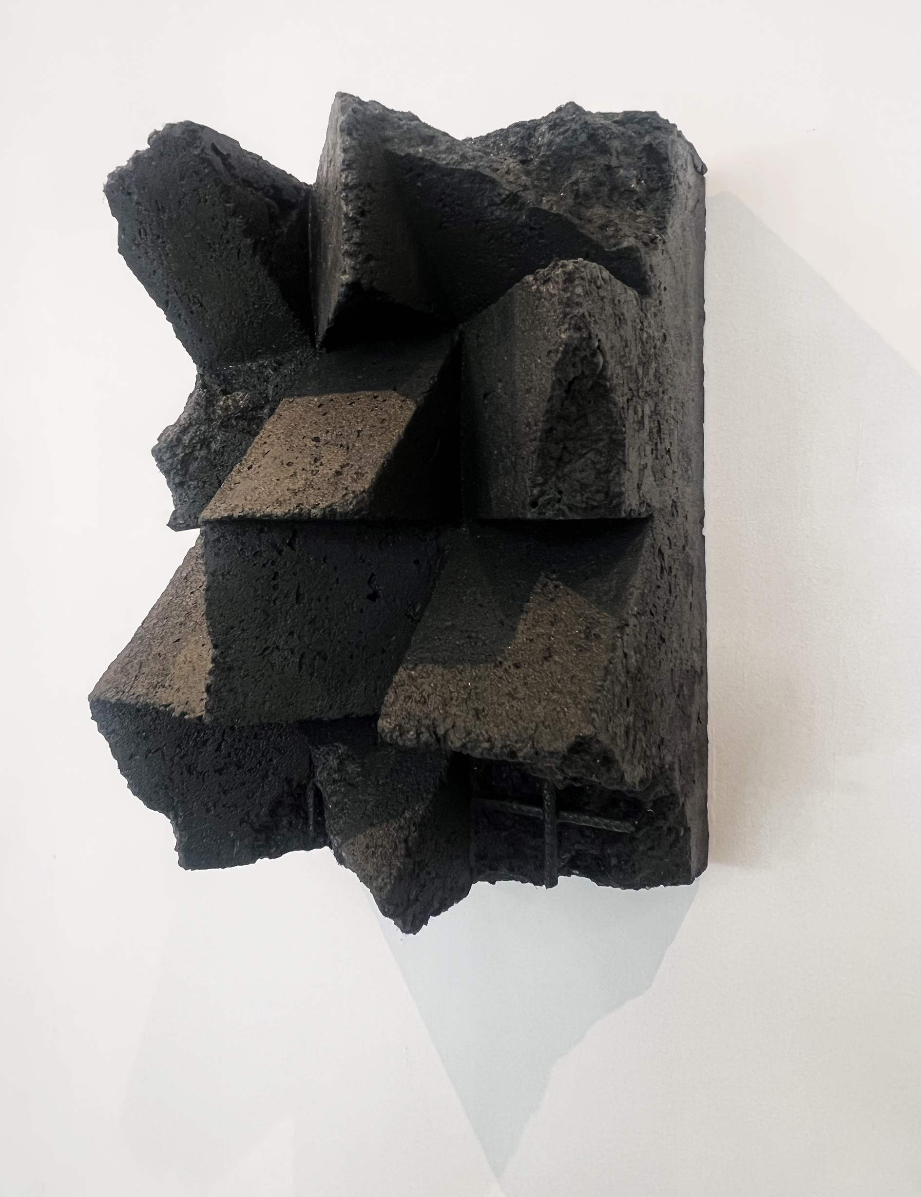
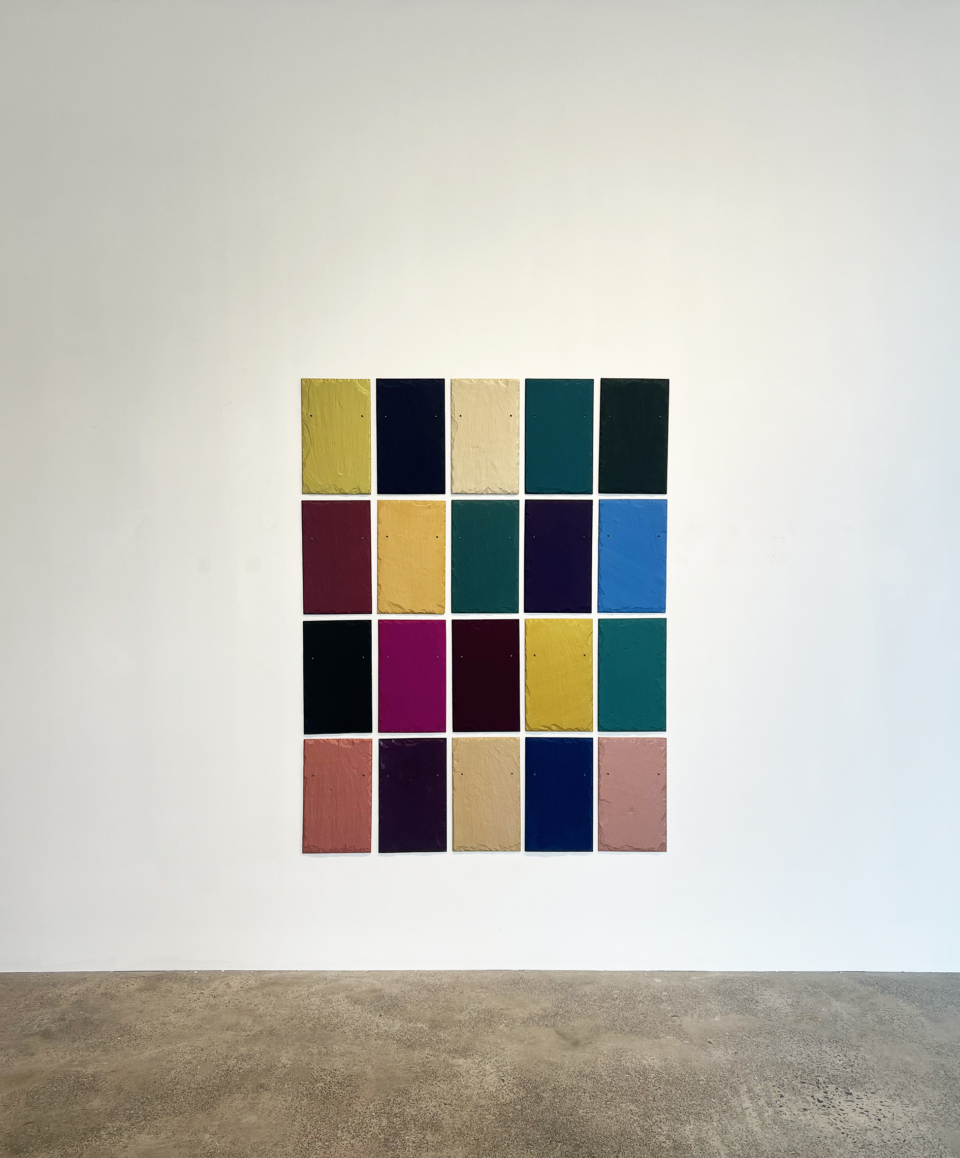
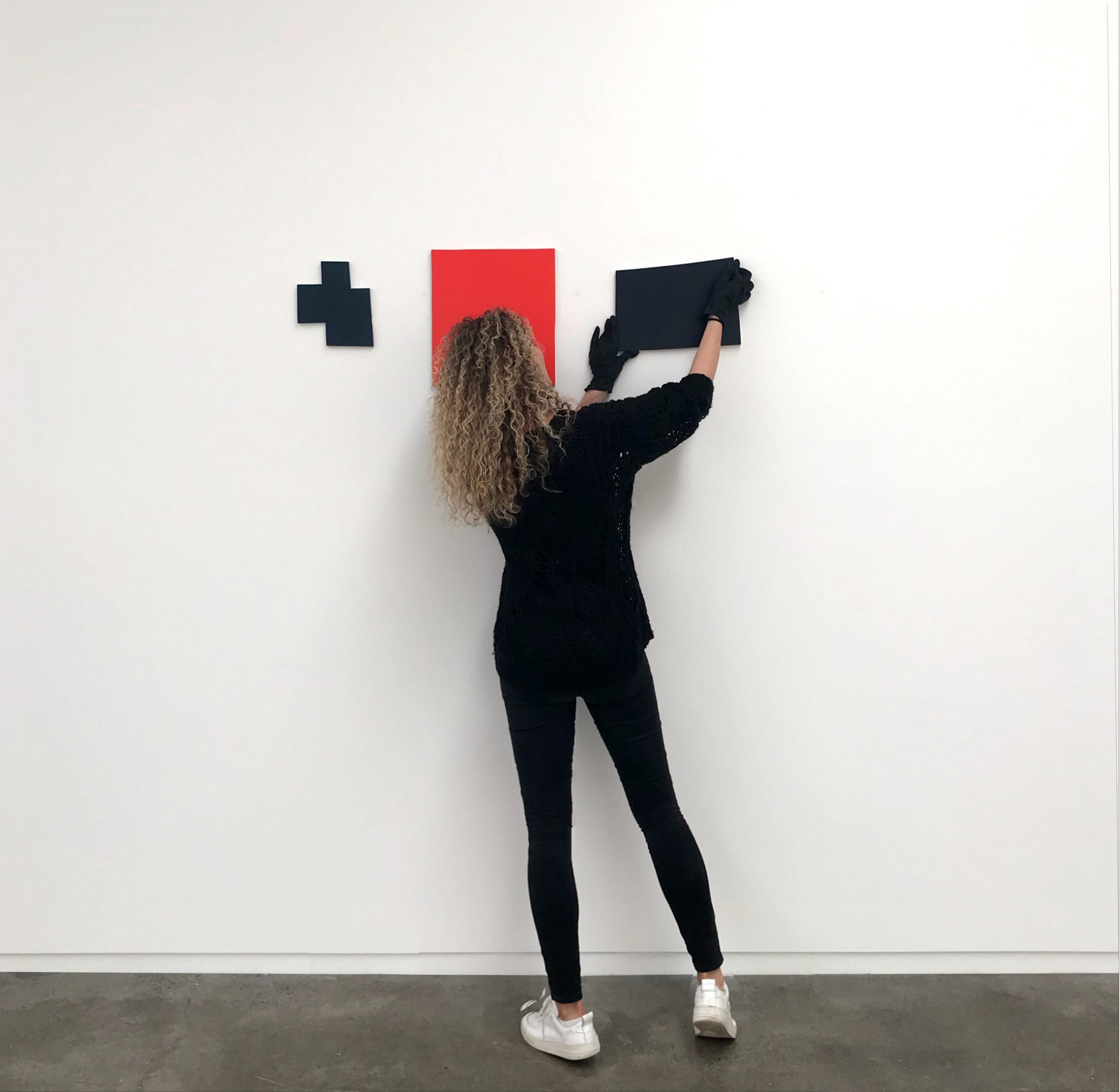
It is clear that Albers, Roeth, Knoebel & Miller are extravagant colourists. Though they are painters, each fold something of a sculptor’s approach to shaping the object, using unorthodox cutting devices to facet their supports. From the wailing chainsaw Jan Albers uses to carve and furrow his substrate to the slate guillotine and specialised hammers that shapes Winston Roeth’s slate supports to Gerold Miller’s hi-tech milling and grinding of aluminium required to shape his precise geometric forms. Imi Knoebel perhaps the closest to Matisse simply picks up the scissors having painted multiple iridescent monochromes, he then layers and collages these elements into expanded grids, both regular and not.
In Knoebel’s grand Cut-Up 16, the clue is in the title but in the smaller suites of Face paintings and Anima Mundi works we see him assembling compositions in a seemingly endless array of possibilities.
Albers’ approach to colour swings between exquisitely nuanced gradations of pigment, transitions that capture soft traces of colour through to dense velvety saturated forms. Then things turn hyperbolic – luminous, neon pigments, edgy with just a touch of toxicity. Hold a Geiger counter close by and they might quicken the clicks and agitate the needle. Though they may feel to be on the verge on radioactive they are filled with allure and magnetism.
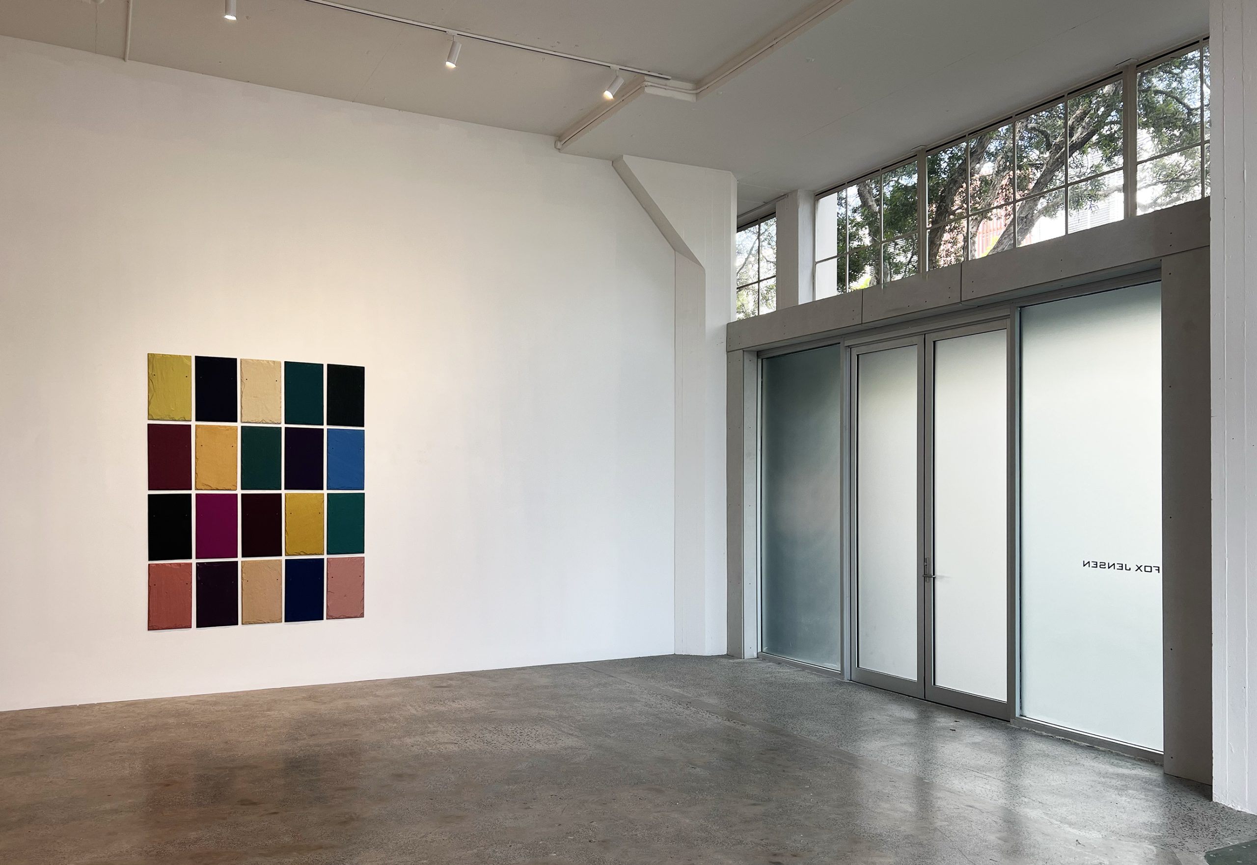
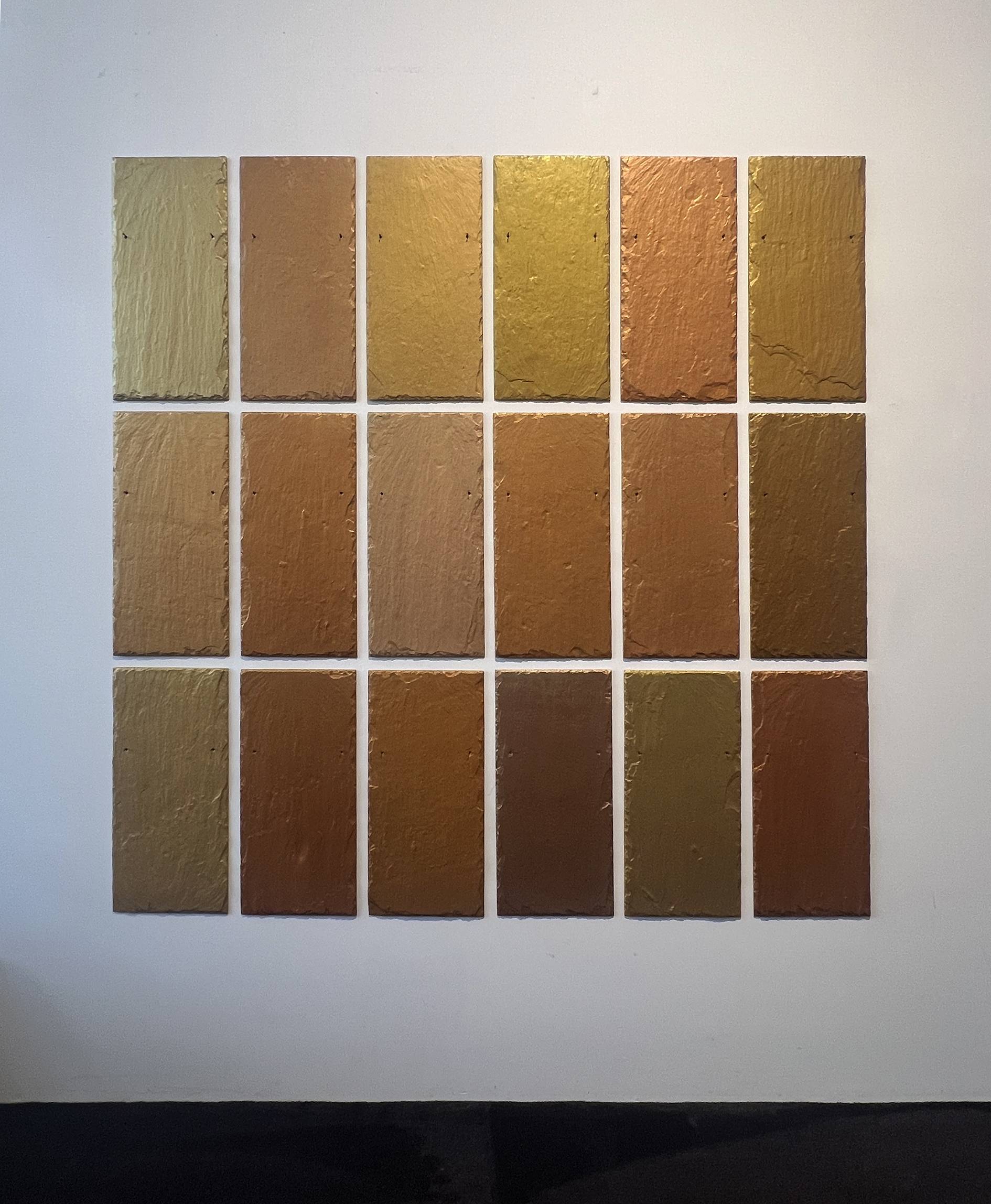
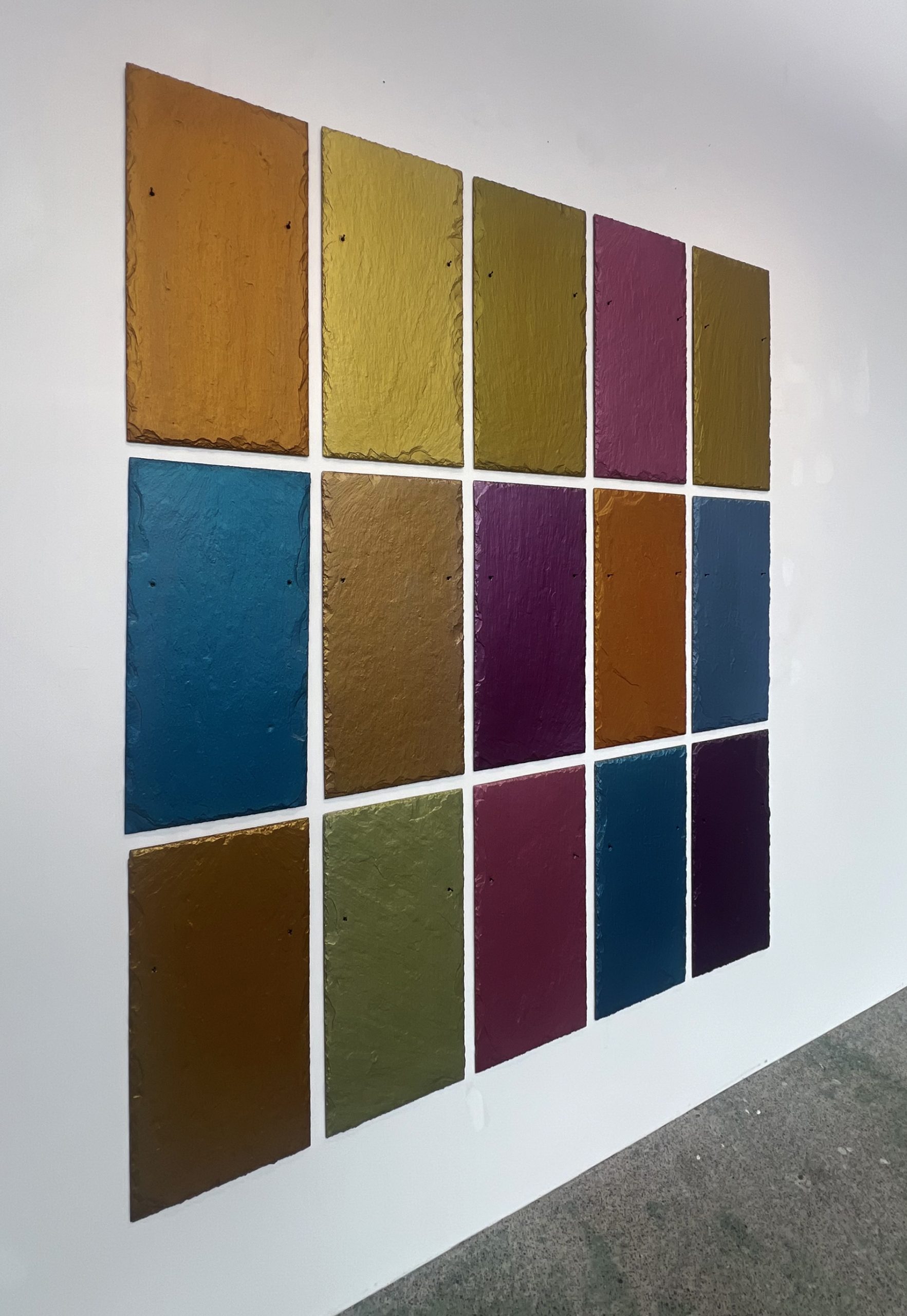
Winston Roeth’s pigments are on the whole a quieter proposition. His use of interference pigments means that they are reactive but not radioactive. They shimmer quietly in the half-light altering the perception of colour and light. Indeed, were you to ask Winston about colour he would gently divert the conversation to one about perception and sensation. Colour is measured by feel rather than by look – thus sensation plays a crucial role.
The slate assemblies we are presenting are certainly animated by the pigment’s responsiveness to light but the topography of the slates themselves with their ravines and peaks enhances this action.
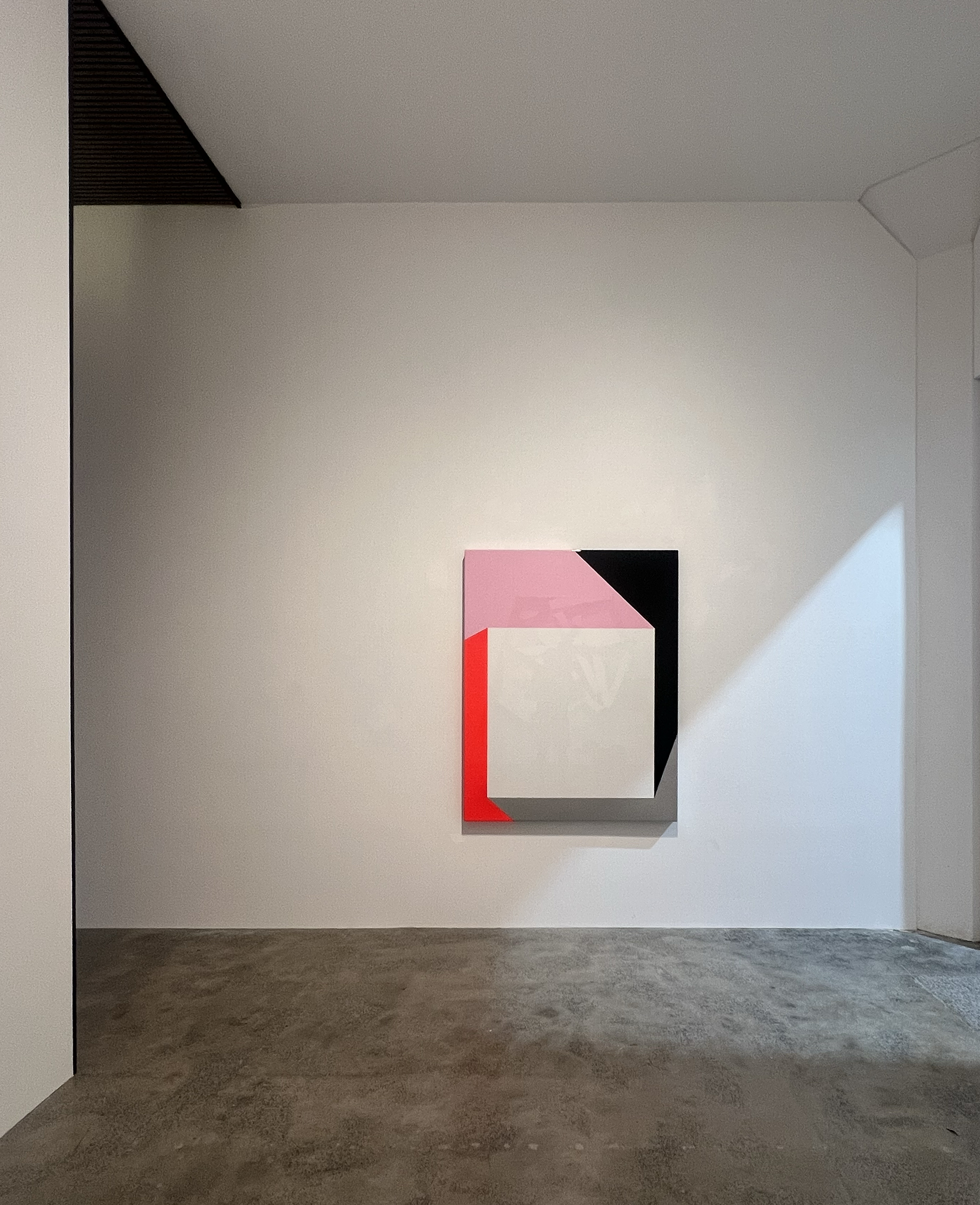
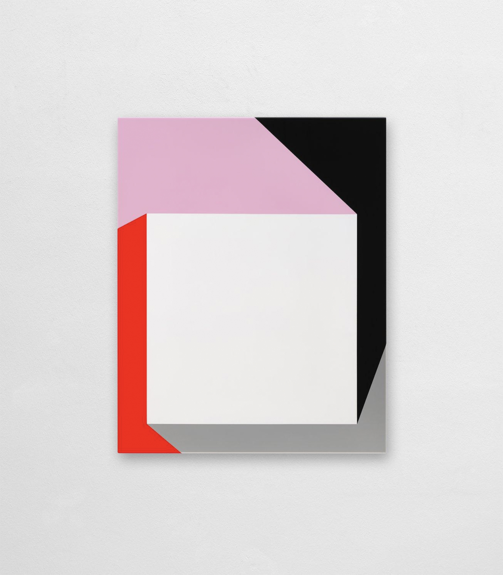
Gerold Miller’s paintings refute the naturalism of Albers & Roeth with their crisp geometry and shimmery perfection. Miller makes shallow reliefs where colour feels infused within the form rather than being applied. They deny colour as an organic material, rather it exists as symbol, a motif or emblem of neo-modernism – utopian purity through exactitude.
Painters they all are but there is not a cedar stretcher nor a folded linen corner in sight. The object nature of their supports allows for an idiosyncratic and exaggerated physical manifestation of the body and dimension that each believe colour can evoke.